In 2013-2014 period the numebr of requests to fix the exising website's HTML&CSS to be responsive raised as well as the new website's to be created are additionally planned to be responsive from the start. Here are a few cases of developing responsive website from the start: LL and Nikit websites.
Also, a few cases of fixing the existing website's responsiveness.
Case #1. Opencart artesaniamx dot com website has a flash logo as seen below on the desktop computer:

But it's version of iPhone iOS could not load flash since it's unsuported and the logo placeholder was blank on iOS device thus unresponsive:
Solution: usung the server side plugin for detecting the device the script outputs either flash logo if desktop or static logo image (png) if mobile device like iPad or iPhone detected.
Case #2. The MODX CMS website has a gif animated intro which is looking bad on mobile device like iPhone due to small size (3.5 or 4 inch at the moment of the issue) of the device's display.
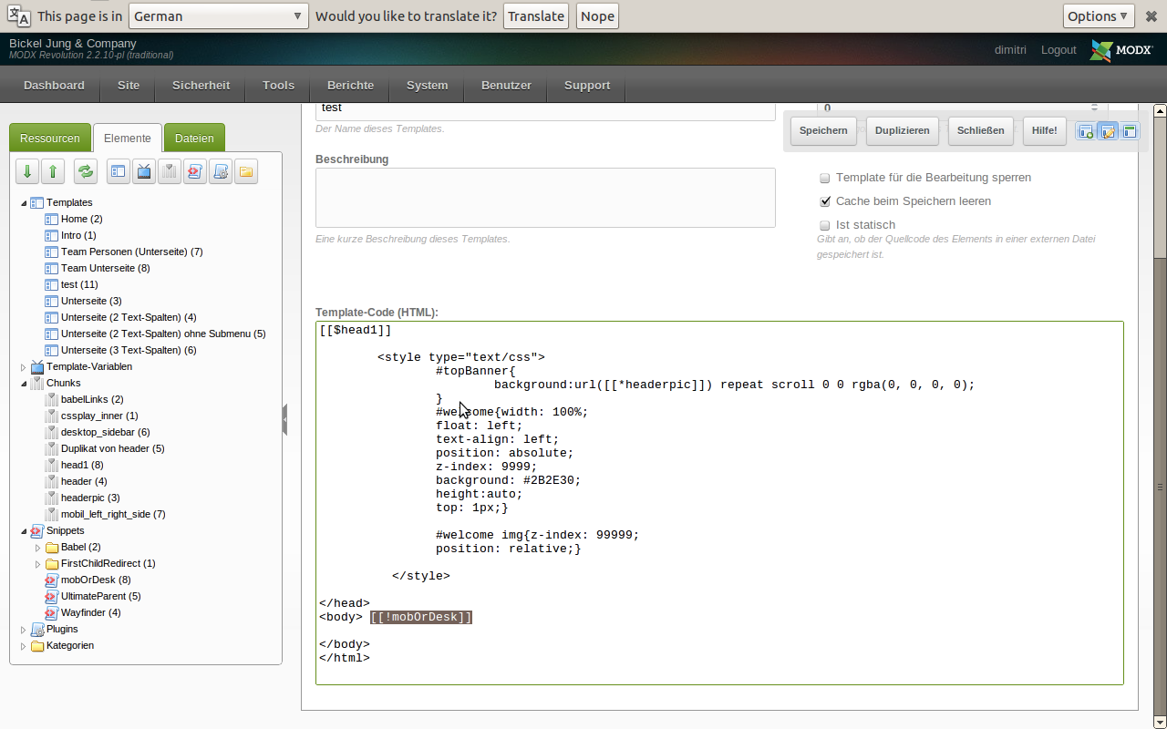
Once our bespoke solution mobOrDesktop introduced to MODX REVO template the into was shown if desktop or not if mobile.
See MODX REVO template's code (backend view-edit template page):

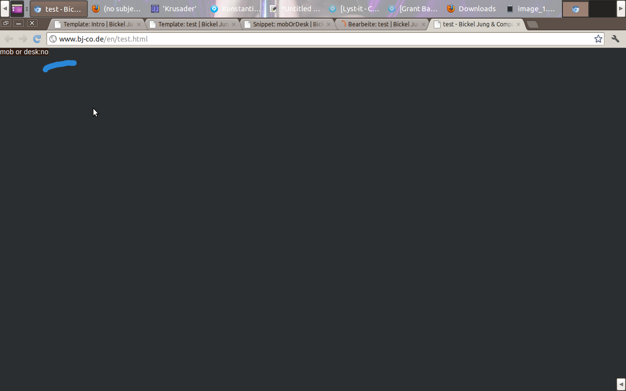
Here is the example of content on the front-end page on mobile device like iPad or iPhone:

Here is another example of content on the front-end page if viewed on desktop:

Hope it is useful and give the idea - let us know, thanks.
Waiting for your C&Q on Google plus 1 and Facebook
